For this gastropub-style eatery, located at Long Beach Airport in Los Angeles, we developed an art deco-inspired identity system saluting the golden-age of aviation in Southern California.
Brewing Up Fresh Creative For A New Coffee Brand.
Deriving its brand name from a well-known truckers' nickname for Los Angeles, Shaky City Coffee Co. is a successful micro-roaster in Southern California.
Founded and launched by a husband and wife entrepreneur team, they not only created and brewed the Shaky City brand, but private-labeled the coffee for a popular local bagel chain. The identity I created conveys the nostalgic feeling of enjoying a fresh cup of coffee at a classic roadside dinner. The bold logo, white cup and blue saucer immersed in a colorful diamond shape instantly resonated with coffee lovers and stirred up huge business for the brand.
The wordmark and favicon are designed using the grid system and customized, bold san serif characters to convey balance, strength & stability. The “r” and “j” are connected by two dots representing technology design & consulting, insulating the client (“i”) in the center.
The favicon design is suggestive of a stylized power symbol, reinforcing Rijke’s commitment to energizing their client’s vision from start to finish.
Drawing inspiration from the iconic bicycle road sign, this favicon and wordmark lockup combines the letters g, e, and b to form the bicycle & rider creating a memorable look for the brand.
Developed for a physician who specializes in pain management, this brand identity works on multiple visual levels. Using positive/negative space, the doctor’s initials (J&C) form cradling hands to reflex healing and a leaf in the center representing a new pain-free beginnings for his patients.
When we initially met with this chronic pain/addiction treatment facility we were given a unique challenge. Incorporate six treatment touch points along with six colors into a new identity.
Our solution was to use interlocking silhouettes of people (touch points) working arm-in-arm to create the best course of treatment with the center representing the patient.
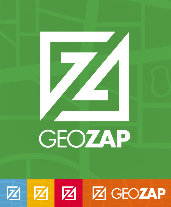
Brand identity for travel app
Designed for an aerospace/defense industry consulting firm. I incorporated the three A’s of Aaronson And Associates to create an aircraft-style icon for the brand. Adding a drop shadow beneath suggests that Aaronson will help your business reach new height in success.
Dr. Deborah Derr always had a love of horses, especially elderly ones. With that passion in mind, United in Light Draft Horse Sanctuary was born. Dr. Derr wanted to create a sanctuary where retired draft horses could live out their senior years in peace. Focusing on that ideal, we developed the brand identity using a simple line drawing profile of a running horse to express its now, care-free existence. Beneath the horse, the name is rendered using a free-flowing customized script font, adding to the sense of freedom these majestic animals now experience. A destressed overlay was added to all the elements further emphasizing their long, weather journeys.
Brand identity design for Nuplazid, a secondary treatment for parkinson’s disease-related hallucinations and delusions.
Brand identity design for a company that specialist in the cycling industry. The letters L & E form the rear wheel & gear of a bicycle.